The Dutch art collections are among the best in the world. They cross genres, times and cultures. Vereniging Rembrandt protects and enriches these collections by helping to collect and restore art, and to do research. By doing so, they ensure that all these collections can continue to inspire us and future generations.
Time to evolve
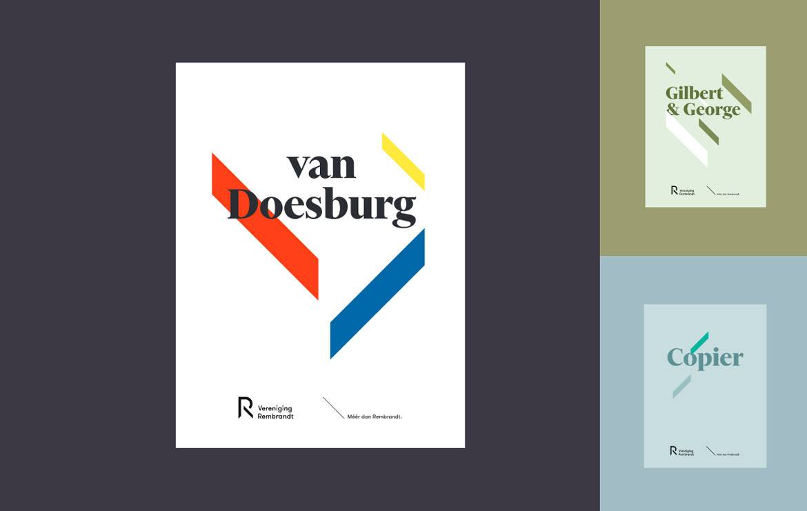
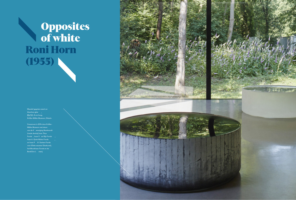
Vereniging Rembrandt asked us to bring more line in their existing corporate identity. Over the years, various agencies had worked with the identity which led to a somewhat diffused appearance. In an exploratory process, we investigated whether the existing style still had enough potential to grow. In the end it was decided that the time was right for an evolution of the visual identity. The new identity should do more justice to the core values of the organization and should leed to a more contemporary style that offers the opportunity to grow with the dynamics of the organization.
Vereniging Rembrandt asked us to bring more line in their existing corporate identity. Over the years, various agencies had worked with the identity which led to a somewhat diffused appearance. In an exploratory process, we investigated whether the existing style still had enough potential to grow. In the end it was decided that the time was right for an evolution of the visual identity. The new identity should do more justice to the core values of the organization and should leed to a more contemporary style that offers the opportunity to grow with the dynamics of the organization.
Attached to red
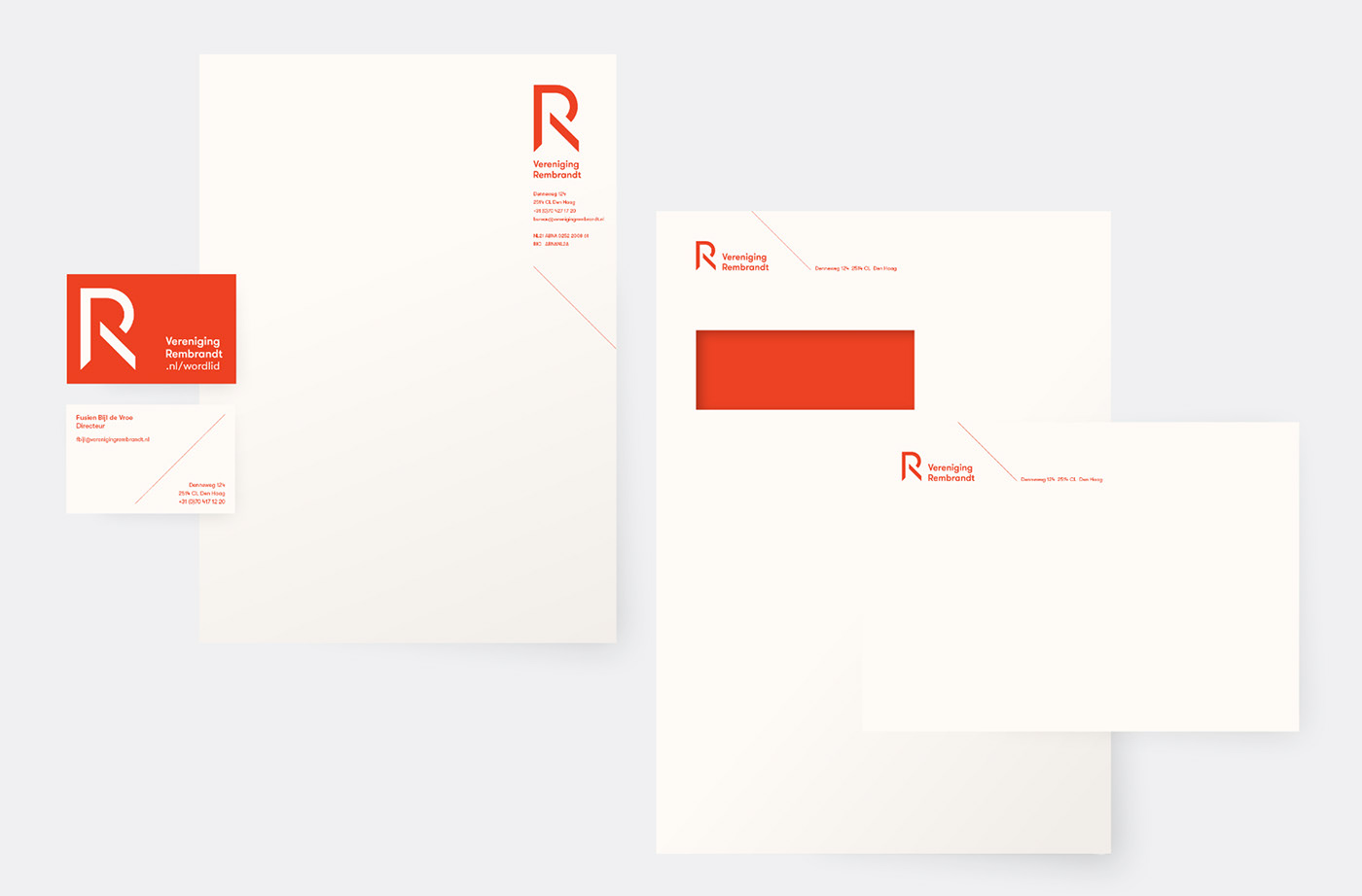
During the exploratory process, two important conditions were set that still made a small reference to the old identity. The color red was highly valued as a reflection of their passion for art and their activities. It was too closely linked to the organization to let go. And given the length of their name, there was also a strong desire for a supporting logotype based on the letter R.
During the exploratory process, two important conditions were set that still made a small reference to the old identity. The color red was highly valued as a reflection of their passion for art and their activities. It was too closely linked to the organization to let go. And given the length of their name, there was also a strong desire for a supporting logotype based on the letter R.


